


Overview:
FIVE SENSES Float SPA is a leading SPA center in the Tri-City area. The project involved conducting a UX audit to identify and diagnose issues users encounter while navigating the FIVE SENSES website.
The Goal
The website’s primary business goal was selling company's services and vouchers, but the entry experience was optimized for visual storytelling rather than conversion. This created a tension between brand experience and revenue performance, so to make the shift, we can split our goal into 3 aspects:
Diagnosing user problems
Formulating hypotheses based on data
Proposing solutions to improve website conversion rate
The Process
Talks with client
This is where it all begins – you can't start working until you understand the issue :) This time, everything went very smoothly. Even though the client wasn't struggling with a lack of customers, they had a feeling that the website's performance could be better. They wanted to improve the site’s user experience, as they had received feedback from their customers about difficulties navigating the site.
That's where I come in.
Getting to know the product
At this stage, I already had a preliminary understanding of who the users of the client’s services are, so now it was time to familiarize myself with the website itself. Using my experience and the principles of good UX for websites of this type, I was able to notice several things at this point that should be changed in order to improve the user experience and, at the same time, increase the conversion rate on the site.
What users actually need
This wasn’t a long stage; perhaps we could have spent a bit more time on it, but we were pressed for time, which, as always, was in short supply 😅
In this case, a quantitative and qualitative analysis of the product proved sufficient. User recordings clearly showed how they interact with the website and where the issues lie within the flow. Further analysis of heatmaps and the quantitative analysis (mainly based on the funnels I created) only confirmed my assumptions. I promise, I wasn’t forcing confirmation of my hypotheses – they genuinely aligned 😇
Key Product Decision
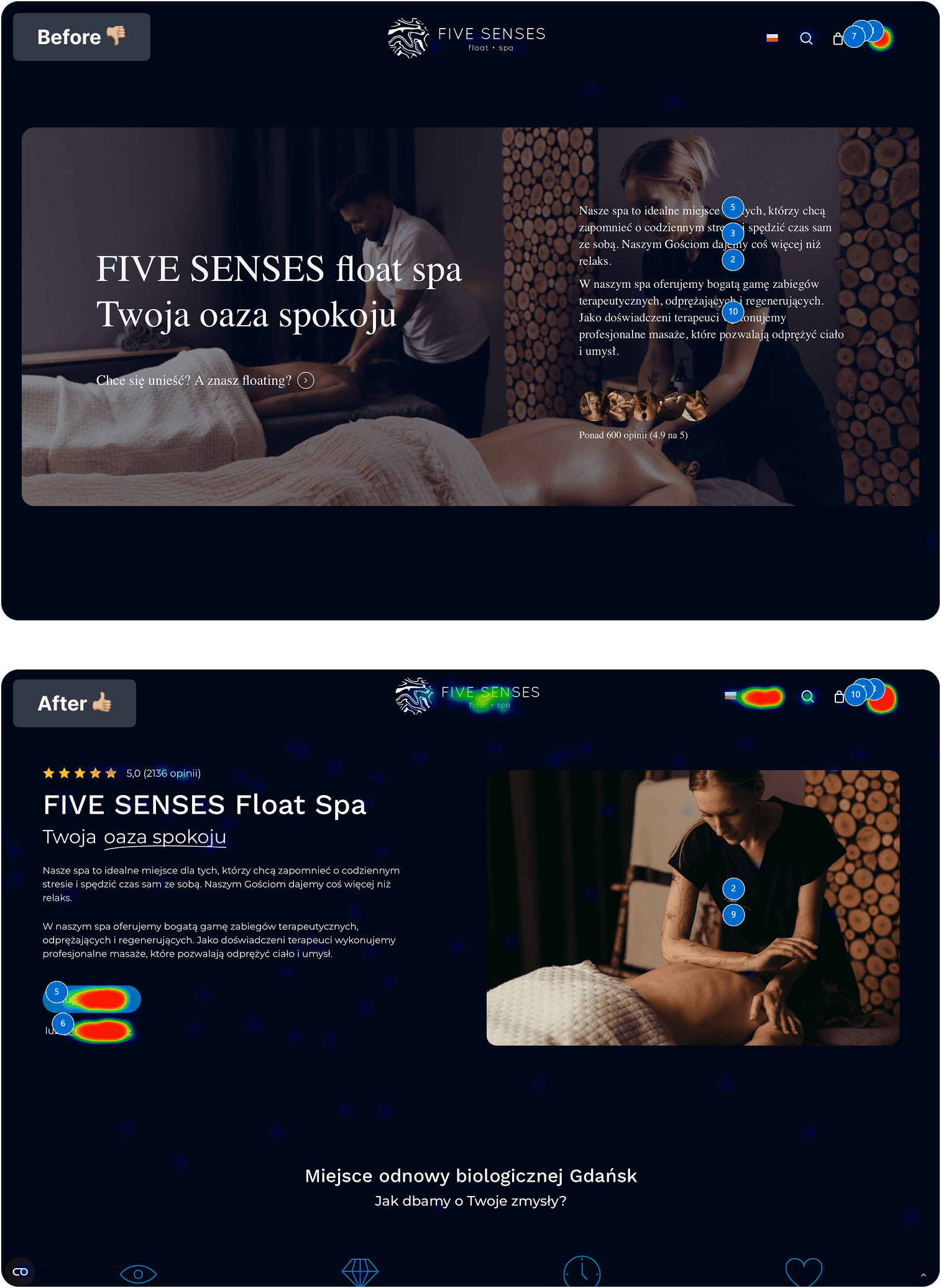
Prioritize conversion over visual storytelling above the fold.
By conducting the audit I diagnosed multiple areas to improve, but the one, main aspect was the Home Page - specifically the top part. My decision here was to simplify the layout to the point where the CTA became the dominant visual element above the fold. Removing a visually rich hero section was a risky decision, as it reduced emotional storytelling and brand “wow effect” above the fold, but the goal was not to delight users visually at this stage, but to help them make a fast purchasing decision.
It's time for changes
When implementing changes, we decided to go with the approach I use in the vast majority of my projects – an iterative approach. After all, if we made too many changes, how could we know which one exactly had the desired effect?
Fortunately, with each iteration we observed positive user feedback, and the especially the heatmap presenting our most important area was a reason for a huge smile - just take a look how we've shifted user attention on the top part of the Home Page:
Results
The result were satisfying for both myself and the client. By observing how users behave on the improved site, reviewing the funnels, and paying attention to the obvious KPI that was important for the client – conversion – we saw a significant improvement. In the case of CVR, there was an increase by 48% 🔥. When it comes to users engagement, we tripled clicks on pages we wanted users to focus on.
