


Overview:
TL;DR
InterviewMe was a complex, evolving product with multiple user types and unclear product-market fit.
My role was to help the team make hard prioritization decisions, reduce complexity, and align design work with business goals - often by saying no to seemingly good ideas.
Context & Problem
This project focused on the full-screen modal for resume customization.
Two experiments had been conducted previously, but due to unsatisfactory results and persistent user issues, we decided to revisit and improve this area. While conducting usability studies, we learned that despite two iterations, the appearance change modal still causes difficulties for users.
Additionally, our resume builder is available on several foreign markets and apart from a few problematic aspects that we observed during usability studies, the thing that was very important to us when preparing the third iteration of Mega Modal was the unification of the design version in all markets, because until now depending on the portal, different versions of the modal performed better.
The Goal
Improve user experience
Unify the components across markets
Increase the CVR
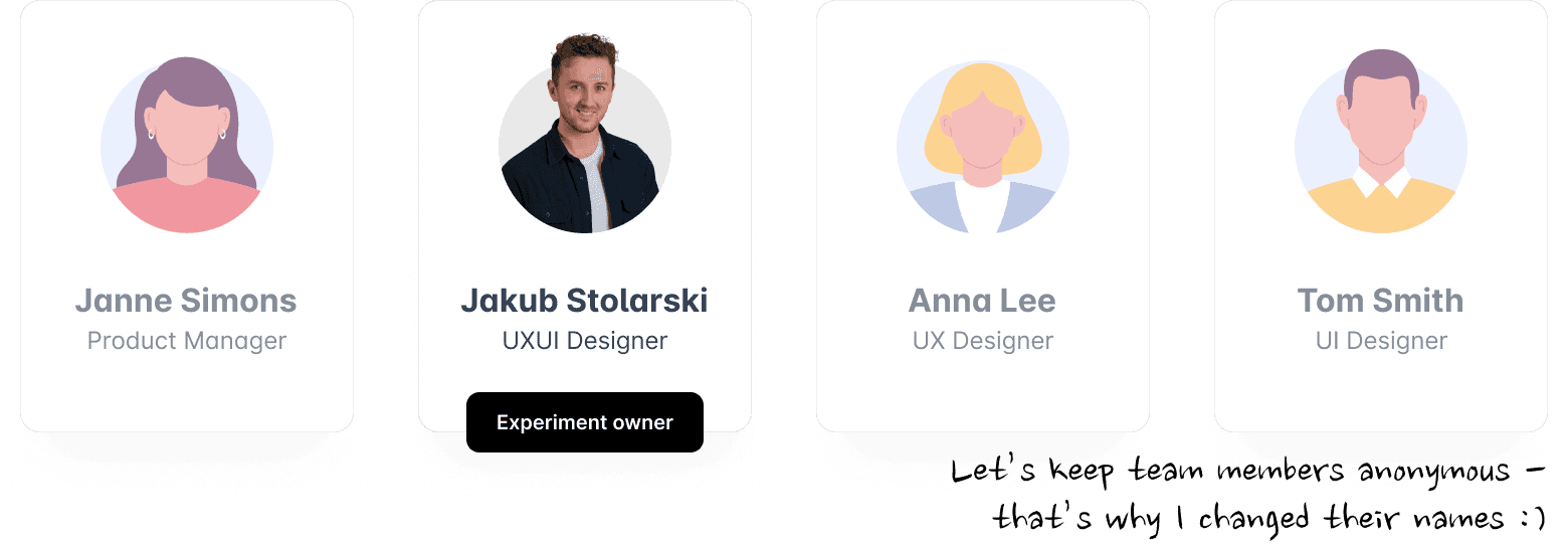
The Team
During this project, I was supported by the design team including PM, UX Designer and a UI Designer. We didn't go through the full project together, but this team was crucial during brainstormings or data analysis. Personally, as an experiment owner, I was responsible for the decision-making and pushing the whole project through.
Decision #1: Who is this product really for?
First of all, we need to clarify for whom the product actually is. And just like that, we came across the first obstacle - although the product technically served multiple user types, treating “everyone” as a target led to growing complexity and diluted decisions. Because of that, the product should be as universal and intuitive as possible, allowing users to feel like at home from the first glimpse. However, for this reason, I had to say "no" to any revolutionary ideas (or at least postpone them for the future iterations). Saying “no” in this case was not about lack of ambition, but about protecting universality and learnability.
Decision #2: Fundaments
The core decision that helped shape out the overall feature was to split the funcionalities into a new, clear tabs. It wasn’t just an organizational choice - it was a way to create mental separation between customization layers and reduce cognitive load.
Decision #3: Where do we reduce complexity to enable scale?
During this project, we had to balance between allowing users to customize their documents the best way possible and with attention to every detail, while keeping the whole experience simplified. With each option, we had to decline multiple, sometimes really exciting or eye-pleasing designs solely because of the cognitive overload risk. So, having that in mind, we went step by step and design the whole area cutting down edge cases and keeping the layout easy to digest. In this case, simplicity became a product strategy, not just a UX improvement.

Evidence & validation
My hypotheses stemmed from analyzing user behavior in the previous iteration. We did this in two ways: through moderated usability testing and by watching recordings of their sessions. Finally, after a thorough dive into the quantitative data, we identified areas for improvement.
After implementing the design changes, we ensured we were on the right track by conducting further usability testing.
The experiment successfully met its core goals. The updated modal reduced friction observed in previous usability studies, supported a unified experience across markets, and contributed to improved conversion within the customization flow.
Impact
As this area of Interviewme is quite complex, the biggest impact wasn’t a single feature, but a clearer product direction that allowed the team to move faster and with more confidence.
Reflection
It was quite a lengthy process, as evident from this case study, but we can clearly state that our three goals were achieved, and some increases in CVR even exceeded our expectations.
Can’t wait for more projects like this!
